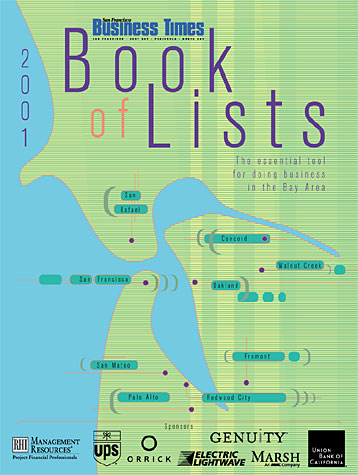
The nightmare of every designer came true for me on this project. The most important publication of the year, the Book of Lists, had very high expectations to fullfill. After a long meeting with all the publisher, researchers and marketing executives we had no idea of what the cover for this year's Book of Lists might look like. I only knew that I had to come up with and image that portraits not one specific location or industry but all of the area that is being covered in the book. Without doing a collage the only thing I could think of was a map. So I proposed the idea to draw an old-looking map of the relevant area and have the book look like a bible or an encyclopdia which is what it is pretty much used as. I got the OK and did research... collected old maps and was on day into the actual design when the publisher saw my screen and shot down the design in its early stages. It looked to "old fashioned" and not "modern" enough for our target audience. I had two days left to come up with a new design that would fulfill those requests. The first day was a complete blackout and I had no new ideas. On the second day I stared to put a "modern" color palette together and think of some "modern" shapes and design elements and by the end of the day I came up with the cover that you see above. 21000 copies have been printed and it was a huge success!
Click on the image for more design.